Art Museum Sketching
The visit to the Art Institute of Chicago was a good one. And not because of the art.
As an AP art class, we visited the Institute to see the art... I think. Really who wouldn't pass up on a trip to Chicago. I wrote my name down just excited to ride a train for the first time.
When zooming through the Museum, trying to absorb all that I could in the time limit, I spotted a cart.
On this cart were pencils, clipboards, papers, erasers, and chairs. Standing next to the cart was an employee. Spread across the room were at least a dozen people. Sketching. Art. At the Art Institute. Sketching the art.
How could I resist.
I went and introduced myself, got a stool and supplies, and started searching for something to draw.
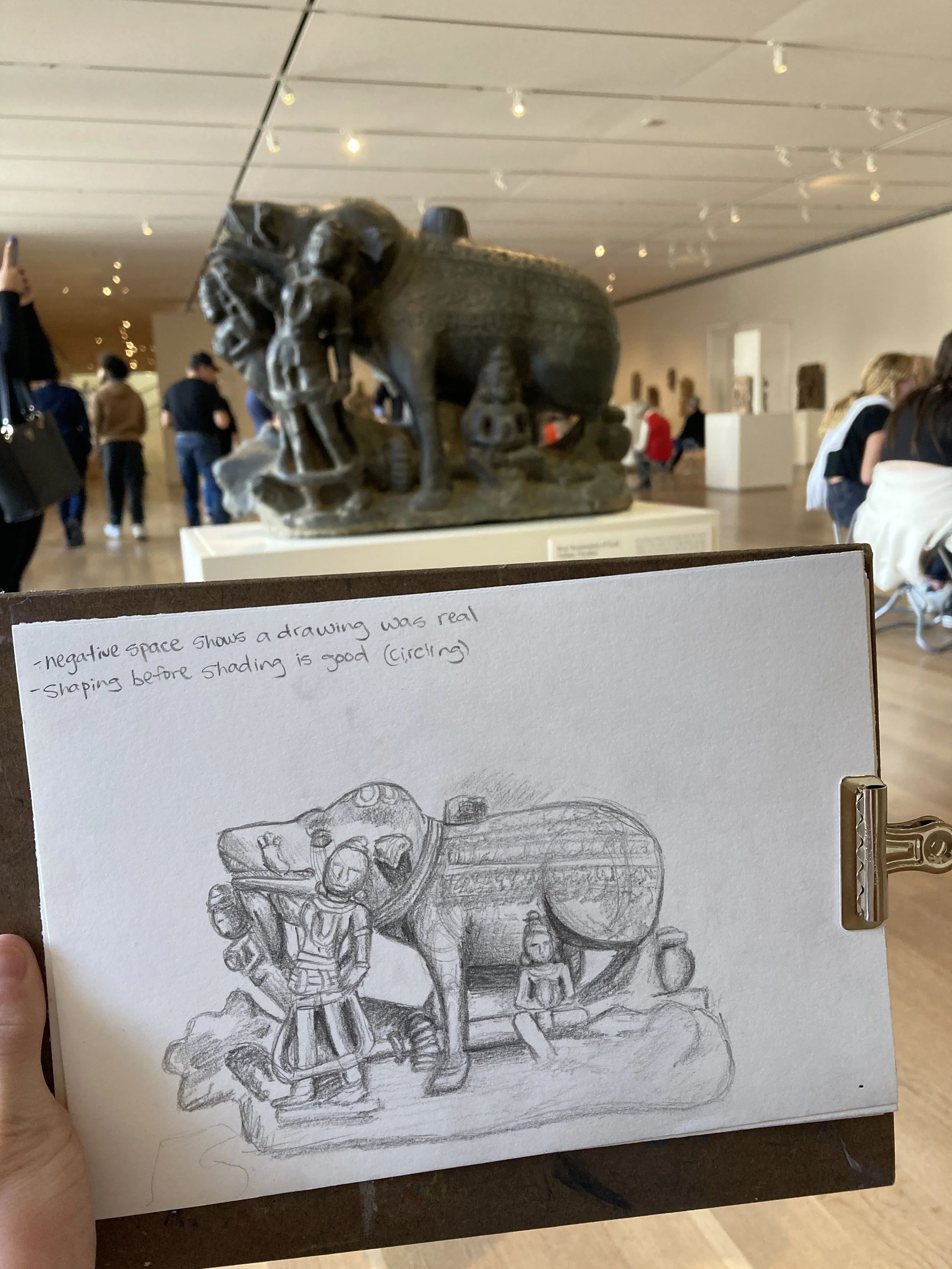
Now this just happened to be a cultural exhibit, and being a bit uncomfortable drawing random deities, I settled for one resembling a pig. There I sat for roughly three hours, drawing a pig.
People passed by, complimented my work, and one even snapped a picture (after asking), but none were as helpful as the artist.
Now the artist had gone around to every sketcher, and was giving tips on how to elevate their art. I had waited for a while, hoping she would walk over and give me some tips too, and then she did.
After politely introducing herself, and asking how much I had drawn before (I had done the artist thing of drawing a billion polygons to show the form before detailing), she asked if I wanted advice. I did.
The 2d drawing was great, she said, if not slightly disproportionate, and when on to share the tips.
The main takeaway though, was the advice about tones. Not music, but the squinting, looking-at-a-pig-sculpture tones. I learned that artists squint not to see the piece better, but to see it worse, or rather, in less detail. They squint to see the values and tones in order to make sure the piece actually lines up to real life. If artists don't use the tones that are really there, they may fall into the amateur trap (as I had) of shading everything simply wrong. The backgrounds of pieces aren't just shaded for the sake of it, but to match the darkness or lightness also backing the reference.
When drawing portraits, it is so much simpler if you have a midtone background, because then you only have to go halfway to meet each extreme. Highlights are white, and dark tones are black, while the rest is already the middle. You can always fall into the issue of some part of your drawing matching the background, but having it non-white is just better.
When shading the background properly, it elevates a piece from 2d to 3d. When you see an apple that seems to pop off the page, it's not just because the apple looks great, but because the shadow is so accurate.
Now that's food for thought.

